Paris-based visual designer and art director creating thoughtful brands and digital experiences.
minga
,
branding
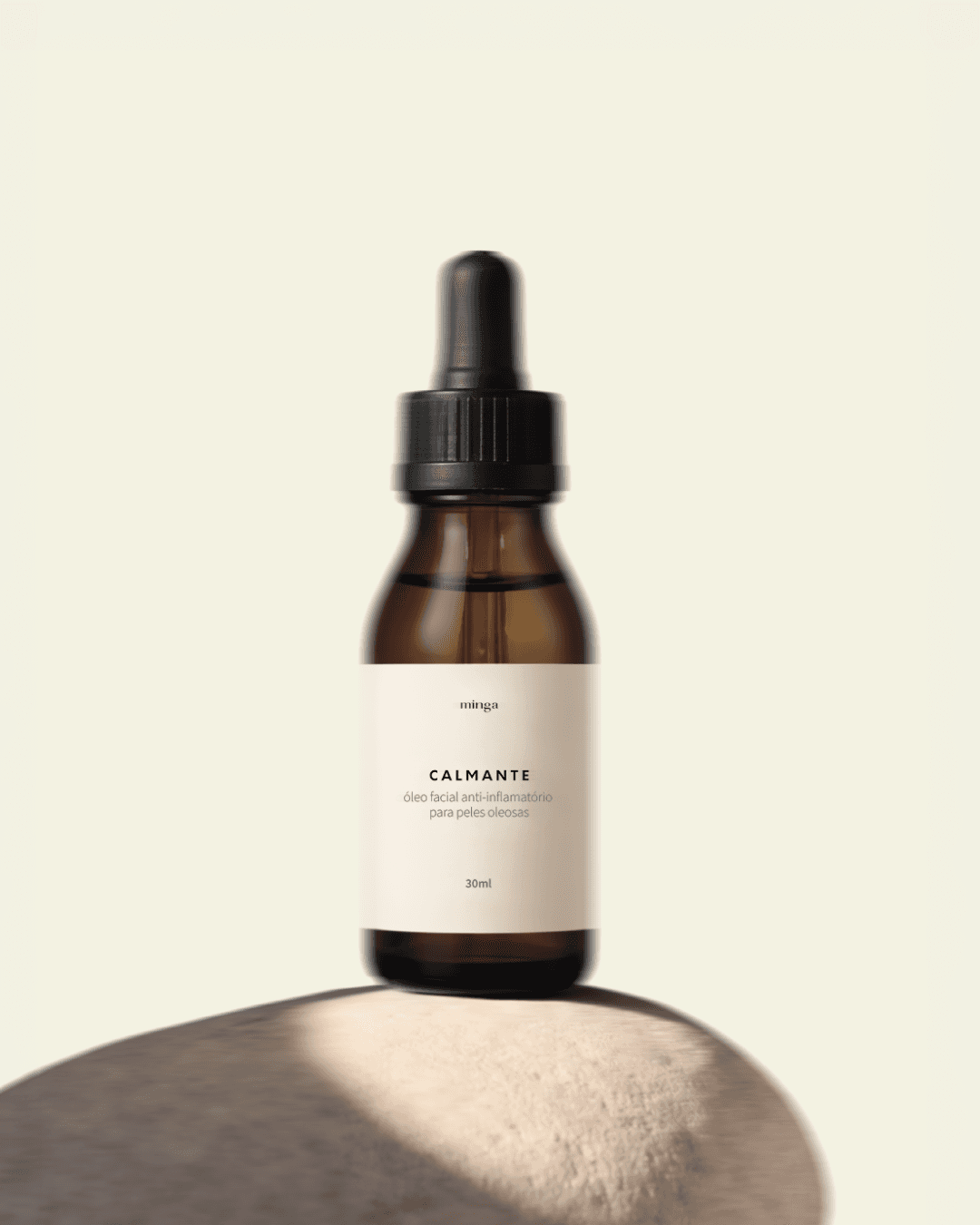
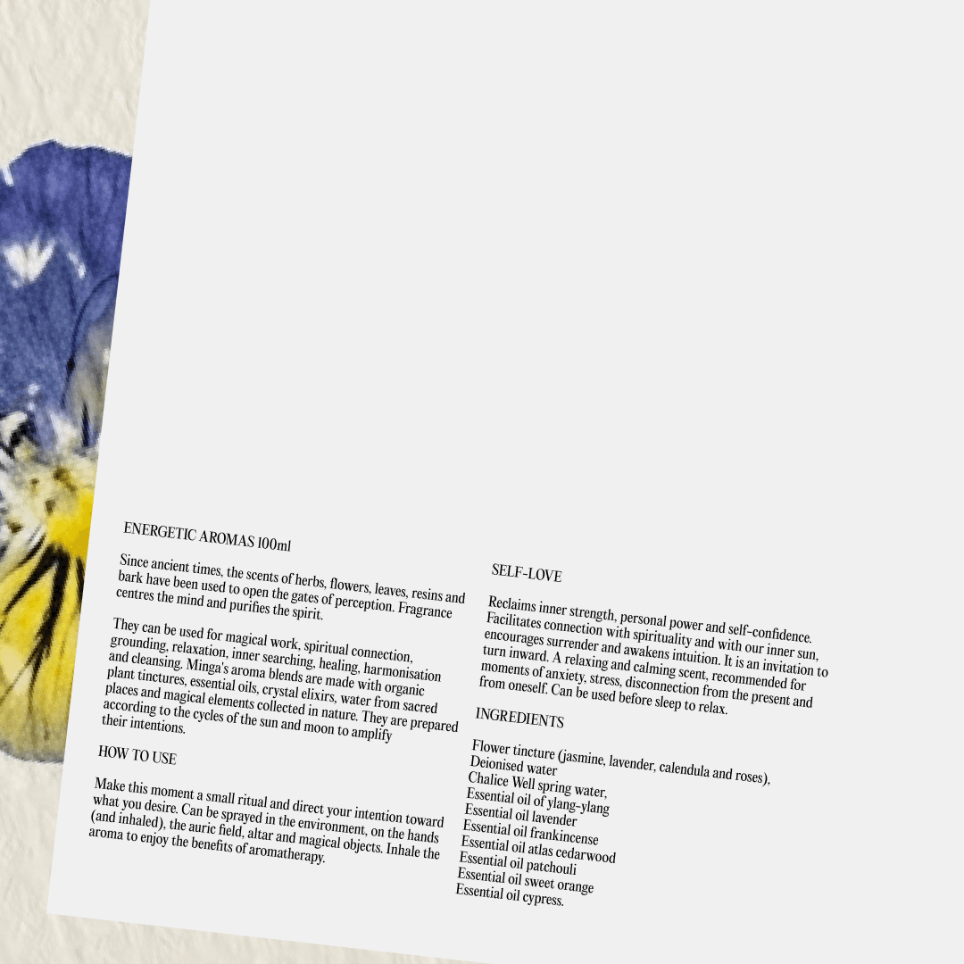
visual identity, art direction and packaging Minga is a botanical skincare brand built on small-batch formulations inspired by herbalism and Ayurveda. The challenge was to translate that philosophy — raw, intentional, close to nature — into a visual identity that felt premium without losing its handmade soul. The identity system balances restraint with warmth: a quiet typographic palette, cream and amber tones drawn from the ingredients themselves, and packaging designed to feel like an object worth keeping. Art direction across photography and print materials reinforces a world that is poetic, grounded, and tactile.

Minga_01.JPG

Minga_02.JPG
Minga_03.JPG

Minga_04.JPG

Minga_05.JPG
Minga_06.JPG

Minga_07.JPG

Minga_08.JPG
minga
,
branding
visual identity, art direction and packaging Minga is a botanical skincare brand built on small-batch formulations inspired by herbalism and Ayurveda. The challenge was to translate that philosophy — raw, intentional, close to nature — into a visual identity that felt premium without losing its handmade soul. The identity system balances restraint with warmth: a quiet typographic palette, cream and amber tones drawn from the ingredients themselves, and packaging designed to feel like an object worth keeping. Art direction across photography and print materials reinforces a world that is poetic, grounded, and tactile.
Minga_01.JPG
Minga_02.JPG
Minga_03.JPG
Minga_04.JPG
Minga_05.JPG
Minga_06.JPG
Minga_07.JPG
Minga_08.JPG
ONORA
,
branding
branding, positioning and brand directrices ONORA is a Brazilian slow fashion brand founded by Larissa Wagner, built on a philosophy of intentional design, craftsmanship, and timeless elegance. The identity needed to hold two things at once: architectural strength and feminine softness. The logotype resolves this tension directly — bold vertical forms carry the structural confidence of the brand, while a fluid connection between the N and O introduces grace and continuity. The result is a mark that feels both minimal and expressive, built to last beyond any single season.

ONORA_01.JPG

ONORA_02.JPG

ONORA_03.JPG

ONORA_04.JPG

ONORA_05.JPG

ONORA_06.GIF

ONORA_07.JPG

ONORA_08.JPG

ONORA_09.JPG

ONORA_10.JPG
Isla de Lobos
,
lookbook
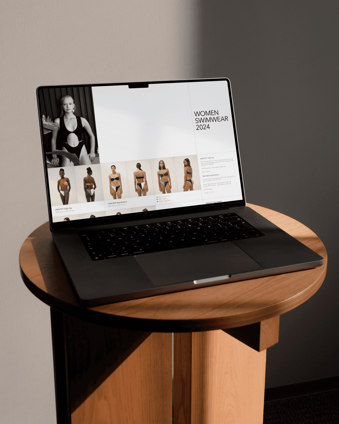
collection lookbook — printed and digital Isla de Lobos is a sustainable swimwear brand built around timeless design and environmental responsibility — eco-friendly materials, ethical craftsmanship, a take-back recycling program. For their Spring/Summer collection I designed the full lookbook across both print and digital formats, creating a layout system that balances editorial fashion imagery with clear product information. I also designed the brand's business cards. The challenge was to let the photography lead while maintaining the clean, considered aesthetic the brand stands for.

ISLADELOBOS_01.JPG

ISLADELOBOS_02.JPG

ISLADELOBOS_03.JPG

ISLADELOBOS_04.JPG

ISLADELOBOS_05.JPG
ISLADELOBOS_06.JPG

ISLADELOBOS_07.GIF

ISLADELOBOS_08.JPG
atOS
,
brand system
A brand system about presence in the digital era, when our phones have become an extension of our minds. With Neta Bar-Stav at Elisava School of Design, I designed visual identity, a custom operational system with two sides (digital upright, physical upside-down), the editorial Expansion of the Mind, art direction, and HandMe, a 3D-printed jewellery-phone case. ADG Laus Silver 2023, Student Category.

ATOS_01.jpg
ATOS_02.mp4
ATOS_3.MP4

ATOS_4.JPG

VTR_05.jpg

ATOS_06.jpg

ATOS_07.jpg

ATOS_08.gif

ATOS_09.gif

ATOS_10.jpg
switch mgmt
,
website
website concept and design Switch MGMT is a model agency founded by Daiana Lüdke, built around diversity, positivity, and a more humanised approach to the fashion industry. The website needed to feel as forward-thinking as the agency itself. I designed the full concept and interface — a rotated logo that plays on the idea of 'switching', horizontal scroll on the homepage, and soft blur effects in the navigation — creating an immersive experience that puts the models, not the agency, at the centre. https://switchmodelmgmt.com/

SWITCH MGMT_01.JPG
SWITCH MGMT_02.MP4

SWITCH MGMT_03.JPG

SWITCH MGMT_04.JPG

SWITCH MGMT_05.JPG

SWITCH MGMT_06.MP4

SWITCH MGMT_07.JPG

SWITCH MGMT_08.JPG
ONORA
,
branding
branding, positioning and brand directrices ONORA is a Brazilian slow fashion brand founded by Larissa Wagner, built on a philosophy of intentional design, craftsmanship, and timeless elegance. The identity needed to hold two things at once: architectural strength and feminine softness. The logotype resolves this tension directly — bold vertical forms carry the structural confidence of the brand, while a fluid connection between the N and O introduces grace and continuity. The result is a mark that feels both minimal and expressive, built to last beyond any single season.
ONORA_01.JPG
ONORA_02.JPG
ONORA_03.JPG
ONORA_04.JPG
ONORA_05.JPG
ONORA_06.GIF
ONORA_07.JPG
ONORA_08.JPG
ONORA_09.JPG
ONORA_10.JPG
atOS
,
brand system
A brand system about presence in the digital era, when our phones have become an extension of our minds. With Neta Bar-Stav at Elisava School of Design, I designed visual identity, a custom operational system with two sides (digital upright, physical upside-down), the editorial Expansion of the Mind, art direction, and HandMe, a 3D-printed jewellery-phone case. ADG Laus Silver 2023, Student Category.
ATOS_01.jpg
ATOS_02.mp4
ATOS_3.MP4
ATOS_4.JPG
VTR_05.jpg
ATOS_06.jpg
ATOS_07.jpg
ATOS_08.gif
ATOS_09.gif
ATOS_10.jpg
switch mgmt
,
website
website concept and design Switch MGMT is a model agency founded by Daiana Lüdke, built around diversity, positivity, and a more humanised approach to the fashion industry. The website needed to feel as forward-thinking as the agency itself. I designed the full concept and interface — a rotated logo that plays on the idea of 'switching', horizontal scroll on the homepage, and soft blur effects in the navigation — creating an immersive experience that puts the models, not the agency, at the centre. https://switchmodelmgmt.com/
SWITCH MGMT_01.JPG
SWITCH MGMT_02.MP4
SWITCH MGMT_03.JPG
SWITCH MGMT_04.JPG
SWITCH MGMT_05.JPG
SWITCH MGMT_06.MP4
SWITCH MGMT_07.JPG
SWITCH MGMT_08.JPG
KAPITAL
,
website
portfolio website and brand materials Kapital is a furniture project by designers Leonardo Lague and Paola Pilla, inspired by a fictional multicultural city — each piece a collision of cultures and materials. The brief was to build a web presence and brand materials that matched that inventive, avant-garde spirit. I designed the full portfolio website, focusing on an immersive, editorial experience that lets the furniture speak. Alongside the site, I developed visual and layout systems for brand collateral — posters, product sheets, and print materials — creating a coherent world around objects that resist easy categorisation.

Kapital_01.JPG
Kapital_02.MP4

Kapital_03.JPG

Kapital_04.JPG

Kapital_05.JPG

Kapital_06.MP4

Kapital_07.JPG

Kapital_08.JPG
KAPITAL
,
website
portfolio website and brand materials Kapital is a furniture project by designers Leonardo Lague and Paola Pilla, inspired by a fictional multicultural city — each piece a collision of cultures and materials. The brief was to build a web presence and brand materials that matched that inventive, avant-garde spirit. I designed the full portfolio website, focusing on an immersive, editorial experience that lets the furniture speak. Alongside the site, I developed visual and layout systems for brand collateral — posters, product sheets, and print materials — creating a coherent world around objects that resist easy categorisation.
Kapital_01.JPG
Kapital_02.MP4
Kapital_03.JPG
Kapital_04.JPG
Kapital_05.JPG
Kapital_06.MP4
Kapital_07.JPG
Kapital_08.JPG
Isla de Lobos
,
lookbook
collection lookbook — printed and digital Isla de Lobos is a sustainable swimwear brand built around timeless design and environmental responsibility — eco-friendly materials, ethical craftsmanship, a take-back recycling program. For their Spring/Summer collection I designed the full lookbook across both print and digital formats, creating a layout system that balances editorial fashion imagery with clear product information. I also designed the brand's business cards. The challenge was to let the photography lead while maintaining the clean, considered aesthetic the brand stands for.
ISLADELOBOS_01.JPG
ISLADELOBOS_02.JPG
ISLADELOBOS_03.JPG
ISLADELOBOS_04.JPG
ISLADELOBOS_05.JPG
ISLADELOBOS_06.JPG
ISLADELOBOS_07.GIF
ISLADELOBOS_08.JPG